

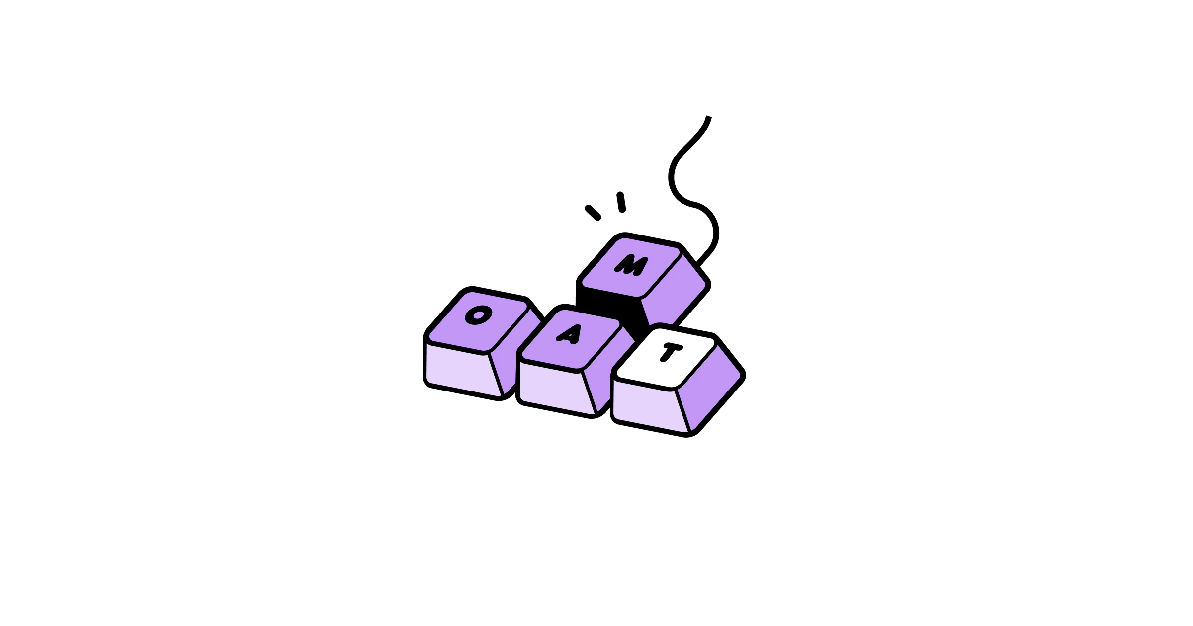
Look & Feel Is Your Moat.
Why attention to details still wins in a world obsessed with speed and MVPs.

How do you design a delightful app?
Why does it matter?
Where do you start?
I could write an infinite series of posts trying to answer these questions.
So let’s do exactly that.
This is an intro, the first in a series of deep dives into how to design great apps—from crafting experiences people love, to the tiny details that set great products apart.
It’ll be a mix of personal experiences, myth-busting, and unapologetic hot takes.
Let’s get started.
People don’t fall in love with a product because it solves a problem.
They fall in love with how it feels.
Yet, most teams obsess over MVPs, roadmaps, and frameworks, convincing themselves that function alone will make users care.
Sure, a few generic apps have shipped and made money overnight. I call them crapps.
Disposable, forgettable and clogging up the App Store (and our feeds).
In their handbook, the Duolingo team makes a key distinction between shipping MVPs and shipping v1s.
They never compromise on experience. They invest whatever it takes to get it right.
So instead of building a minimum viable product, how about aiming for a minimum lovable product?
Honestly, it doesn’t take much. Just don’t fall into the trap of treating your product’s DNA as a branding exercise.
The difference between another disposable tool and something people actually want in their lives? Soul.
Sometimes they don’t even need it—but they want it. They enjoy it. And for 99% of social consumer apps, that’s the whole game.
When was the last time an app made you smile?
Or surprised you?
Or made you want to open it again, instead of letting it rot on your 45th home screen page, buried under a pile of forgotten apps?
What does it really take to earn a prime spot on a user’s first home screen, or even in their muscle memory?
That question shaped everything we did at Zenly. We knew we couldn’t rely on the usual product playbook, so we wrote our own.
The app already existed, but its iconic look and feel didn’t start with user interviews or market research. It started with a logo. A vibe. Custom emojis that traditional product thinking would call unnecessary polish. A waste of time.
That waste of time became our moat.
It didn’t just define how the app looked. It shaped how it thought, how it spoke, how it moved.
Every interaction was an opportunity to surprise, to delight, to do something unexpected.
While others played it safe, we made things different—sometimes harder— because that’s what made it memorable.
That’s why every Zenly clone failed miserably. (Besides Bump of course, Zenly’s rightful heir).
The goal wasn't to build a utility.
It was to create something that felt more like a toy than an app.
Daniel Gross once said:
Opening Zenly is like unwrapping a cool lemon pop on a hot summer day. It’s colorful. It smiles at you. When you think of Zenly, your inner eye sees rainbows.
At amo, I thought we had a head start, applying these same principles, building on everything we had learned.
After years of Zenly product evolution, I figured we had a playbook—that the right moves would come naturally.
I was wrong.
Starting over from scratch, going back to basics, was daunting in ways I didn’t expect.
We knew we wanted amo to feel premium—somewhere between tech, fashion, and culture.
So in those first few months, Valentin and I obsessed over look and feel. We leaned hard into that high-end, luxury aesthetic.
And it backfired.
Our apps looked slick. Clean. Polished.
I guess it had a soul, but it was too exclusive, too far from what we wanted to create.
No more head start. Back to the drawing board.
Because sometimes we’re just wrong. There’s no formula, no plug-and-play framework for building something that feels right.
Funny enough, the debate—art vs. science in product design—was the topic of a recent Friends of Figma event I spoke at.
I didn’t hesitate to stand for chaos, for creativity. For trusting the messy, instinctive side of design.
Because when you’re starting from scratch, data won’t save you. Intuition will.
Innovation doesn’t begin with numbers. It begins with a feeling.
Your app’s DNA isn’t just visuals and branding though.
It’s how it moves, speaks, and feels—the sum of every interaction that makes users think “wait, that was different.”
Your product is a persona. Its tone should be warm, playful, sharp—whatever fits. But it should never sound like it was written by ChatGPT. (We all see you…)
Sound design matters more than people think. I know, most of us keep our phones on vibrate. Still. That satisfying click, that subtle confirmation chime, the quirkiness.
We obsessed over sound at Zenly and amo, and it never disappoints, thanks mostly to Gus, our amazing sound designer.
You know you get it right when your Japanese fans are doing tiktoks with your stuff.
Haptics are the invisible magic of great experiences. That tap-tap-taaaaap feedback. The micro-vibration that makes a button feel real.
That “crazy onboarding" with those perfectly tuned vibrations in that new app everyone’s talking about.
Haptics make digital interactions feel physical, turning swipes and taps into something you feel, not just see.
Nico designed custom haptics at amo, and our users loved every bit of it.
Or this tweet.
Motion design isn’t just decoration. It’s the language of interaction.
The way elements glide, bounce, or settle. The difference between something feeling static or alive.
We’ve built a solid reputation for fine-tuning custom transitions and pushing shaders to their limits.
Because when motion is done right, it’s not just eye candy, it’s clarity, personality, and intent in motion.
These details aren’t icing on the cake.
They are the difference between forgettable and iconic.
In 2025, everything is built faster, cheaper, worse.
Yes, you should leverage AI to speed up development or build a proof of concept.
Yes, you should build with efficiency in mind.
But don’t confuse speed with craft.
As Jordan puts it:
Hunt for that smile-trigger moment. That one detail that turns a passive user into a lifelong ambassador.
There’s a reason why we remember the Yik Yaks, the Vines, the Paths, the Rdios, the Mailbox.
They went above and beyond. They obsessed over the details.
Yeah they’re all gone.
But we still talk about them.
The biggest risk isn't being wrong.
It's being forgettable.
Julien.