

Icons Love Letter.
Why icon design still holds the power to shape your product's voice.

Welcome back to another playbook issue, I’m glad you’re still here.
The newsletter recently crossed 1,000 subscribers. Huge milestone, thanks for the support and for being part of the adventure 🫰
There’s so much ahead for the playbook, new ideas, new formats, exclusive content, amongst other things.
You might also notice subtle design and layout changes starting to roll out. I’d love your feedback, so let me know what you think.
Today is the second entry in my How to Design Great Apps series, following the previous popular issue, Look & Feel Is Your Moat.
In today’s design era, and with the multiplication of tools, of technological advancements, it’s easy to forget what got us started in a first place.
My career owes a great deal to iconography.
I became a designer because of icons.
Icons were my first product jobs and fast forward, they shaped and sealed my career.
Every designer I know has a favorite icon set.
Or favorite icons you keep copy and pasting from one project to another, years after years.
Everyone uses them. Few obsess over them.
Icons are probably the most underappreciated part of product design.
Would you randomly choose a font for your product’s typography?
It’s hard to write about iconography and its impact in tech without mentioning Susan Kare pioneering work in the 80s.
For Apple, she designed pixel art representations of familiar objects, like a trash can for “delete” actions. Sounds familiar?
I highly recommend watching this interview of Susan if you want to learn more about her, her inspirations, her creative process.
There’s a strong lasting legacy of iconography in the tech industry and following Susan’s work, there’s been crucial milestones along the way until today.
During the 2000s and early 2010s, customizing the look and feel of Mac OS X was common-place within the Mac community.
Sites like MacThemes were constantly creating new themes, custom icon packs to enhance Mac OS X.
I stumbled upon MacThemes forums by the time I was working at Behance, and was in awe with what I saw there. I kept trying to copy and reproduce my favorite designer icons with millions of layers in Photoshop.
Endless nights of painful trial and error. I wish I had the courage to ask some of them some tips but I don’t regret the hassle.
It kind of trained me in taste (if taste can ever be trained?), precision, technical skills, speed. All these skills later applied to UI design, and eventually, product design as a whole.
One could argue typography is the secret weapon. Well, it’s another one for sure, but more on that later.
Icons too, can make or break a product.
It’s easier than ever these days to just go on Figma Community or ask ChatGPT to generate an icon set for you.
Don’t get me wrong, with attention to details, proper instructions and iterations you get surprising results.
But don’t be tempted to just "slap that set” into your product without any thought or soul.
Designing your own icons can actually help you tie brand, tone of voice, and product design together.
Michael Flarup, author of the App Icon Books, said that “icons are a window to your product soul”.
To this day, I keep using icon design in every single new project or product I’m working on as a gateway to the look and feel I want to get.
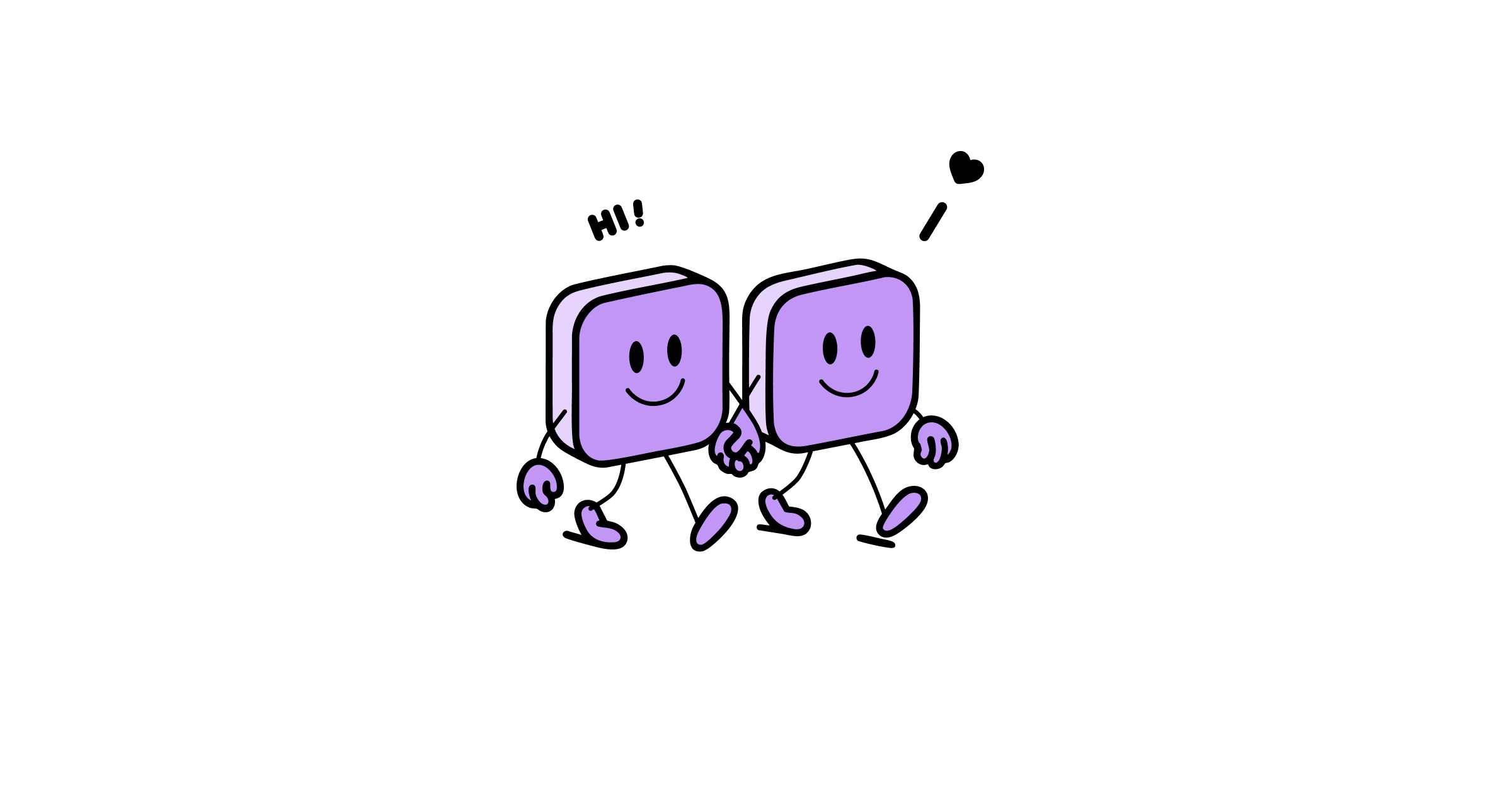
Icons, just like typography, can be used as a very powerful halo effect to the vibe of your app, your website.
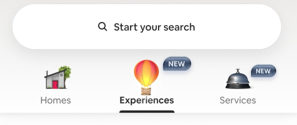
What Airbnb did in their Summer 2025 updates demonstrates this perfectly.
Granted these are not just UI icons but beautiful animated illustrations, but they still act as a halo effect.
Designers at OpenAI are also crafting delightful details in their products, such as in ChatGPT or like this cute icon in Codex.

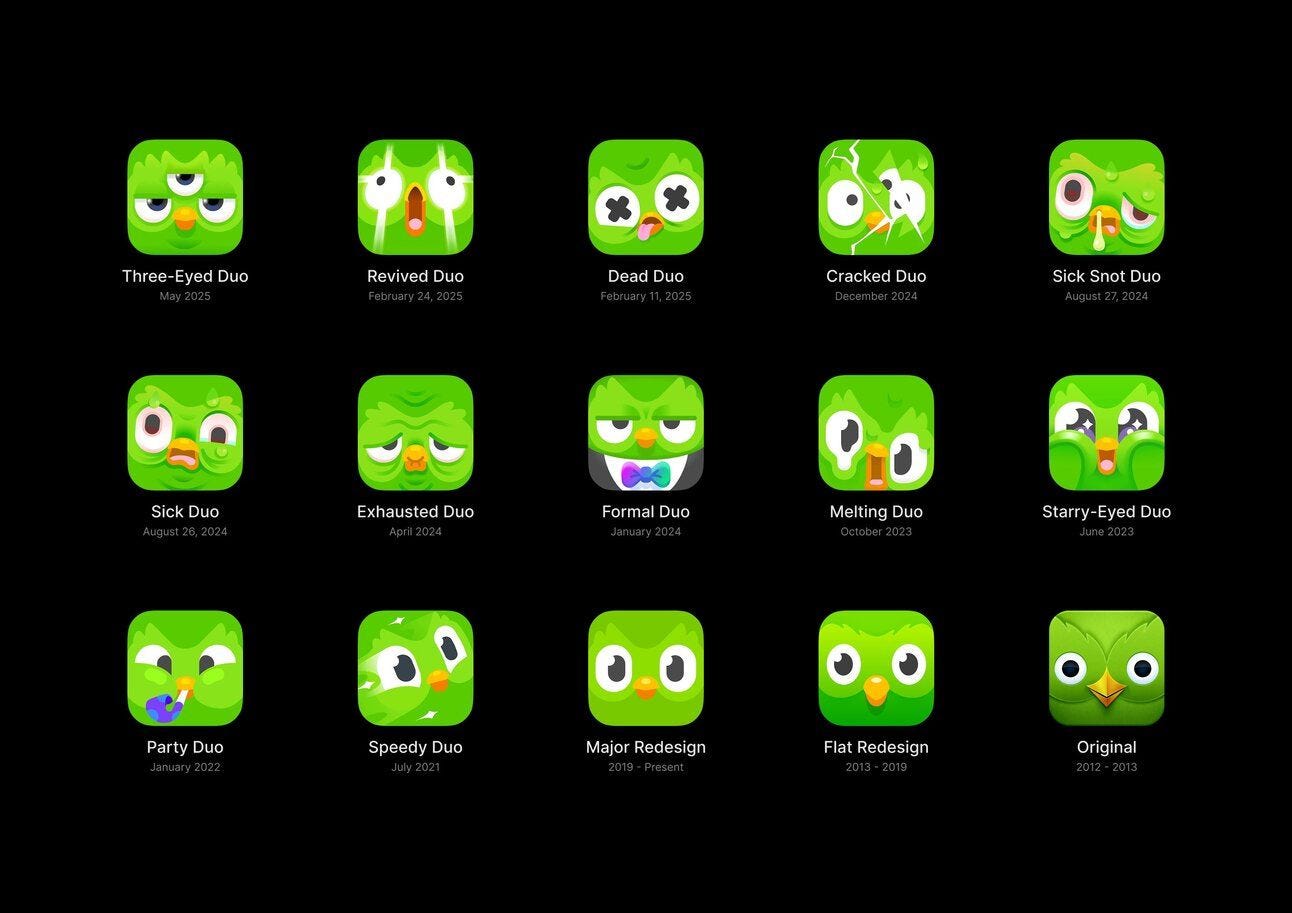
And of course it’s hard to talk about delight in icons without mentioning Duolingo and their consistent work in app icons and brand.
App icons are your work’s window to the world out there.
Especially in a sea of millions.
It might sound like a no-brainer but many studies and industry experiments consistently show that improving an icon can boost user interest.
One A/B test found that simply changing a mobile game’s app icon led to a 100% increase in conversion rate from views to installs.
100%.
In other words, twice as many people decided to download the app when presented with the more appealing icon design.
To be honest, app icons are one of the simplest and most cost-effective ways to build trust and engagement.
Period.
Remember when Instagram hate was all over the place for changing their app UI as well as their iconic app icon?
The New York Times called this: The Great Instagram Logo Freakout of 2016.
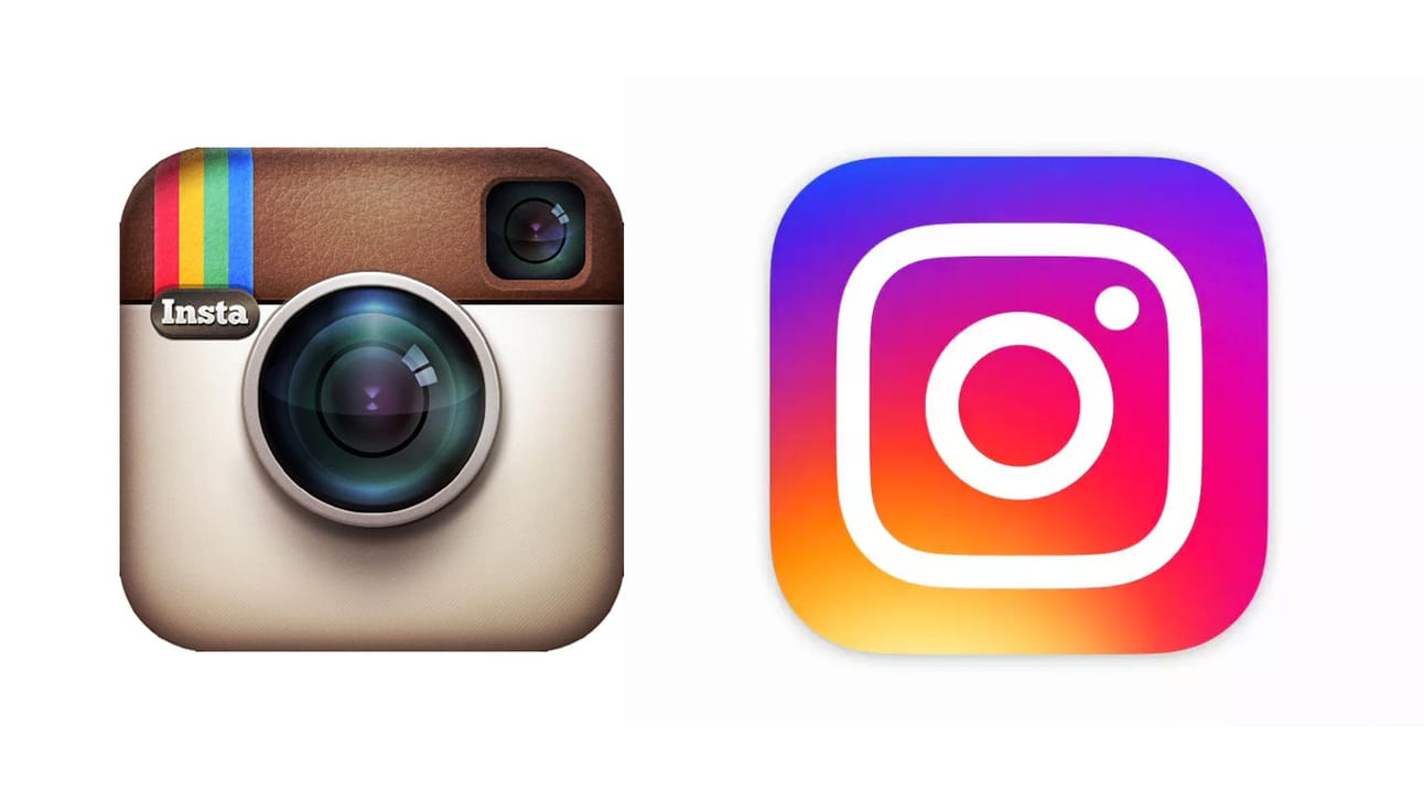
If you didn’t watch the whole Instagram redesign story featuring Ian Spalter in the awesome Abstract Netflix Series, please find some time to do so. It’s a bit outdated but still packed with great insights.
I mean, I’m still in love with skeuo icons but this global backlash didn’t age well. The impact and legacy of this redesign in terms of engagement, growth and retention is massive and unprecedented.
Icons and app icons are not decorations. They’re identity.
They signal taste, intent, and care.
And in a sea of homogenized user interfaces, they’re one of the few frontiers left where your product can feel truly unique.
If you lack time or can’t afford designing your own icons because you’re in early stage, use these tools to move fast:
Apple SF Pro Symbols: simple yet super efficient. It’s crazy how so few designers know about this Apple tool.
Iconists Central Icon System: probably one of the best icon sets out there by the goats at Iconists.
If you want to learn more about what it takes to design your own icons and dabble with some pixels. Or just want to educate yourself:
OG Tim Van Damme’s Figma Icon Jam: a free icon design course by one of the best designers in the world.
The Icon Handbook by Jon Hicks. An oldie but goldie. Still some nuggets there if you can put your hands on a copy. It’s basically my bible.
I could go on for a lot more, or even provide a cool timelapse of an app icon I designed for fun with Spline and Figma. But let’s keep this for another time.
Now it’s your turn.
Time to get those pixels pushed!
Julien.